
English source · 6 min
A visual workspace for shops and apps
The useful Canvas idea is a shared overview of real pages, followed by direct work on one selected page or element. The current editors share the overview and contextual tools described below while retaining their native definitions and publication owners.
Working now: image captions in the existing editors
Products → Media, Shop design → select an image or hero → Edit, and
App Studio → Design → select an image expose an Image caption field.
Choose an enabled content language in the existing editor language selector.
Missing/null translations inherit the shop's main language; an explicitly empty
caption stays empty. Captions appear below the image. Accessibility alternative
text remains separate. Rich document images preserve captions in their existing
title attribute and display them in Preview and the storefront.
Suggest with AI uses the shared native merchant.media.caption operation,
current assistant.use permission and central inference configuration. Review or
edit the suggestion and choose Use in draft, then save through the native
editor. Generation itself saves and publishes nothing. The operation is also
available through the ordinary MCP registry and generated input contracts.
Owned product assets and bundled public fashion images provide decoded, bounded image evidence. Public HTTPS images use the existing DNS-pinned, public-only fetch policy with no redirects. Credentials and private-network destinations are denied. Images are reduced to a PNG thumbnail before inference. When pixel evidence is unavailable, the review explicitly says that the suggestion uses current content. An App Studio image has no selected app-record image in the design inspector, so its caption suggestion uses the app/image description rather than invented pixels.
Changing image, language, current text or request scope discards a pending proposal.
Revoked UI access hides generation; native authorization still runs on every call.
Product captions remain part of the product aggregate. Page captions stay inside
the site-builder app document. App images use the existing localized Block.text.
No new database table, runtime, executable markup or publication mechanism is added.
One overview for shops and apps
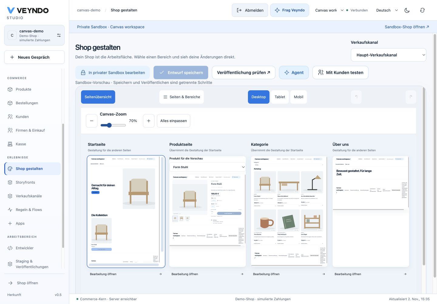
Shop design and App Studio now use the same zoomable scene board. Drag its
background to pan, use the zoom control or press +, - and 0 while the board
has keyboard focus. Fit all fits the current group. At most four scenes are
mounted together; additional pages are reached with the view arrows. A large
catalogue is never loaded just to fill the overview.
Shape the shop
- Open Shop design and choose the sale channel. The board shows its real home, a selectable product, a category listing and its content pages.
- Choose Edit on a page. Click a section to reveal its properties. Collapse Properties and Pages & sections whenever the preview needs room.
- Drag an element to the insertion line. Selected sections expose move, duplicate and delete controls. These edit the existing page document and undo history.
- Return to Page overview, open another page and come back. The unsaved page, its selection and undo history stay in this workspace. A channel change warns before discarding unfinished work. Save each page explicitly before reloading.
- Review the existing selected sandbox publication when ready.
Product and category tiles open their existing native data editors within the workspace, retaining the page draft behind them. Native product/category writes keep their normal permissions, revision checks and history. Those editors change product/category data; the board does not introduce arbitrary product-detail or category layout templates. Global shop design remains inherited from the home. Original Storyfront Experiences continue to use their own editor.
Shape every app placement together
An app starts in its placement overview, for example merchant product panel, product detail and checkout summary. The placement name leads each scene so views with the same app name remain distinguishable. Choose Edit to work on that view. Elements opens the compact graphical palette; Properties opens only when needed. Both can be closed. The app identity, section selector, private environment and version save remain in the compact header.
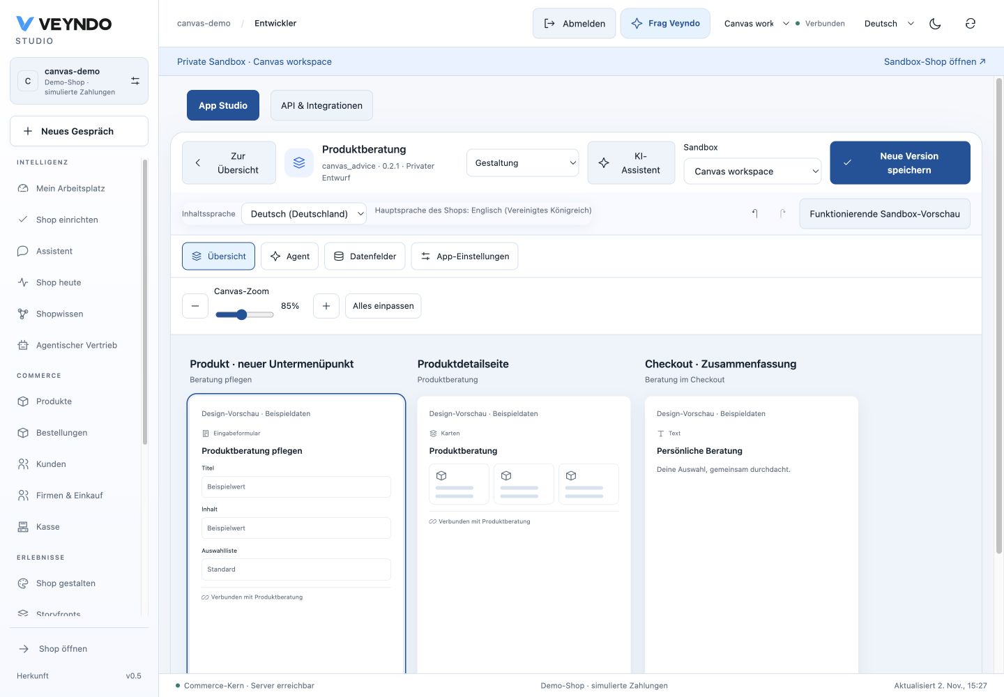
Selected stack and grid elements share move, duplicate and delete actions. Duplicated elements get a new ID; handlers and field bindings remain in the same Manifest. Grid duplicates receive a bounded position offset. Stack drag/drop marks the insertion boundary and uses that boundary even when the pointer ends on the intervening canvas area. Existing keyboard controls provide an alternative to dragging.
For a button or input choose Edit behavior. The existing graphical logic editor edits its typed click/change handler. Open Flow Builder reaches the existing automation editor; an app event is the link to a shop Flow. This does not turn a button handler into a second Flow runtime. Data fields and App settings open the existing definitions, then the section selector returns to Design without replacing the edited Manifest. Version save, private functional preview, staging and selected release retain their native owners.
One contextual agent
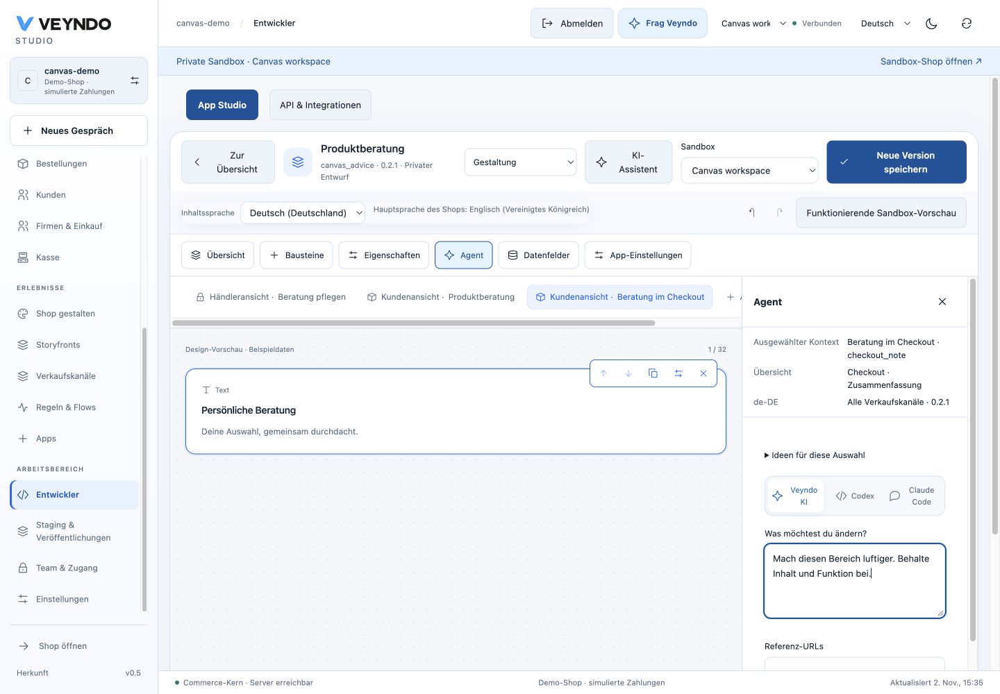
Agent opens the right dock alongside the overview or selected view. The dock shows the selected placement, element, content language, app version and scope. App definitions apply across channels, displayed explicitly as All sales channels; page proposals retain their selected sale channel and revision.
Write a request, supply up to three public HTTPS reference pages or upload up to two PNG/JPEG/WebP screenshots/designs. Client preparation bounds decoded image size and encodes a reduced image; native validation independently enforces format, byte and dimension limits. Shop and app references share the public-only, DNS-pinned fetcher. A page that cannot be captured safely is marked unavailable. Captured HTML is partial reference evidence, never rendered or executed.
Veyndo AI uses central structured inference with image evidence. Codex/Claude Code
receive the same current Manifest, selected context, schema and bounded references
through the native task export. Invalid or stale selections are rejected before
inference. The existing developer.task operation exposes that context through
MCP and generated TypeScript/WIT/OpenAPI inputs. Screenshot HTTP requests have a
4 MiB limit on the two specific developer routes; ordinary MCP transport limits
remain unchanged, so large images use HTTP task export.
Preview proposal shows the candidate on the same board or selected scene. Current draft switches back. Neither action adopts the candidate. Adoption requires the existing explicit review and an unchanged Manifest/environment. Late responses from another environment or changed selection are not adopted. App generation retains the existing action authority and business contracts.
Reference status, URLs and digests are retained with the immutable development version and return after reload. Raw image pixels and fetched HTML are not retained in the build record. The current dock shows uploaded thumbnails while reviewing; this is not a permanent original-design asset library.
Reference and verification
Shopify documents the side-by-side overview, pan/zoom, fullscreen editing and selection-aware Sidekick in Canvas navigation and Canvas customization. These inform the workflow; the native editors and publication model remain Veyndo’s.
Local caption acceptance records the tested source, storage, renderer and provider-fixture boundaries. See also the existing shop design guide, product media and app workspace.
Canvas acceptance and tested boundaries records the connected native and browser journeys.
Direct product and category editing
Product and category editors load their own shared catalogue styles when opened directly from the Canvas. Their layout does not depend on a previous visit to Products or App Studio. Product sections remain beside the form on desktop and use the existing compact section selector on narrow screens. The shared Canvas wrapper owns its own spacing. Native language, revision, permission and private save paths remain the same.
The blue Edit action appears above each scene preview. The fixed toolbar also lets you choose a view and open it at normal control size, independently of Canvas zoom. Both entry points use the same native editor callback and disabled state.